Note
Go to the end to download the full example code.
Histograming map data#
How to inspect the histogram of the data of a map.
import matplotlib.pyplot as plt
import numpy as np

import astropy.units as u
from astropy.coordinates import SkyCoord

import sunpy.map
from sunpy.data.sample import AIA_171_IMAGE
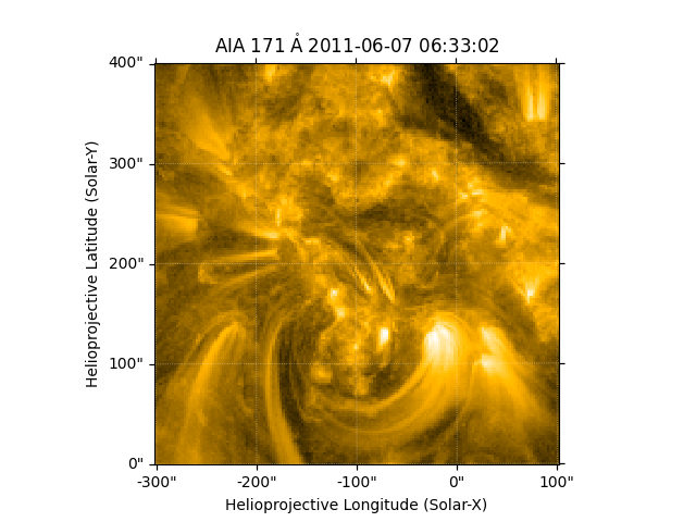
We start with the sample data and create a cutout.
aia = sunpy.map.Map(AIA_171_IMAGE)
bottom_left = SkyCoord(-300 * u.arcsec, 0 * u.arcsec, frame=aia.coordinate_frame)
top_right = SkyCoord(100 * u.arcsec, 400 * u.arcsec, frame=aia.coordinate_frame)
aia_smap = aia.submap(bottom_left, top_right=top_right)
aia_smap.plot()
<matplotlib.image.AxesImage object at 0x7d02a5479450>
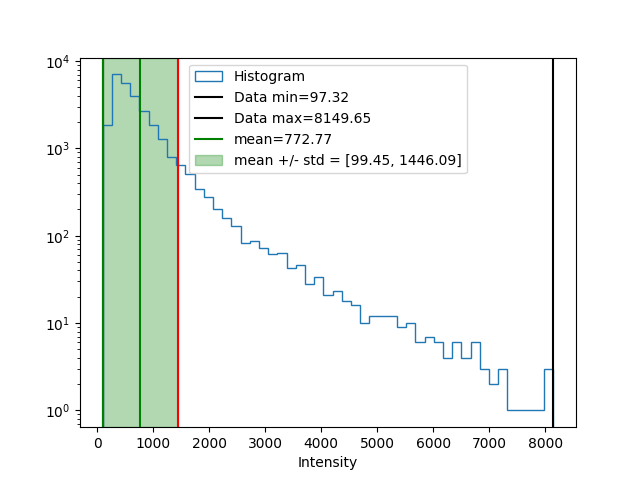
The image of a GenericMap is always available in the data attribute.
Map also provides shortcuts to the image minimum and maximum values.
Let’s create a histogram of the data in this submap.
num_bins = 50
bins = np.linspace(aia_smap.min(), aia_smap.max(), num_bins)
hist, bin_edges = np.histogram(aia_smap.data, bins=bins)
Let’s plot the histogram as well as some standard values such as mean upper, and lower value and the one-sigma range.
fig, ax = plt.subplots()
# Note that we have to use ``.ravel()`` here to avoid matplotlib interpreting each
# row in the array as a different dataset to histogram.
ax.hist(aia_smap.data.ravel(), bins=bins, label='Histogram', histtype='step')
ax.set_xlabel('Intensity')
ax.axvline(aia_smap.min(), label=f'Data min={aia_smap.min():.2f}', color='black')
ax.axvline(aia_smap.max(), label=f'Data max={aia_smap.max():.2f}', color='black')
ax.axvline(aia_smap.data.mean(),
           label=f'mean={aia_smap.data.mean():.2f}', color='green')
one_sigma = np.array([aia_smap.data.mean() - aia_smap.data.std(),
                      aia_smap.data.mean() + aia_smap.data.std()])
ax.axvspan(one_sigma[0], one_sigma[1], alpha=0.3, color='green',
           label=f'mean +/- std = [{one_sigma[0]:.2f}, {one_sigma[1]:.2f}]')
ax.axvline(one_sigma[0], color='green')
ax.axvline(one_sigma[1], color='red')
ax.set_yscale('log')
ax.legend(loc=9)
<matplotlib.legend.Legend object at 0x7d0287cd5810>
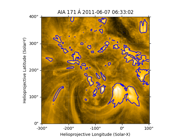
Finally let’s overplot the one-sigma contours.
Total running time of the script: (0 minutes 0.407 seconds)