Note
Go to the end to download the full example code.
Computing Cross-Correlations and Time Lags#
This example shows how to compute cross-correlations between light curves and map the resulting time lags, those temporal offsets which maximize the cross-correlation between the two signals, back to an image pixel.
This method was developed for studying temporal evolution of AIA intensities by Viall and Klimchuk (2012).
The specific implementation in this package is described in detail in Appendix C of Barnes et al. (2019).
import dask.array
import matplotlib.pyplot as plt
import numpy as np
from mpl_toolkits.axes_grid1.axes_divider import make_axes_locatable

import astropy.units as u

from sunkit_image.time_lag import cross_correlation, get_lags, max_cross_correlation, time_lag
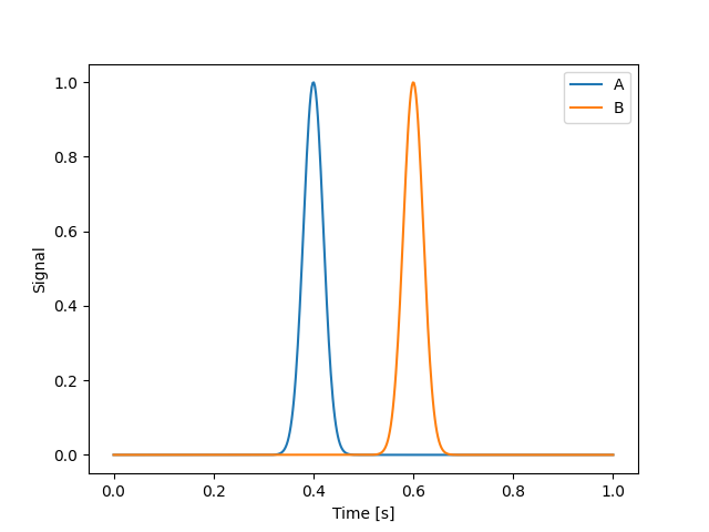
Consider two timeseries whose peaks are separated in time by some interval. We will create a toy model with two Gaussian pulses. In practice, this method is often applied to many AIA light curves and is described in detail in Viall and Klimchuk (2012).
def gaussian_pulse(x, x0, sigma):
    return np.exp(-((x - x0) ** 2) / (2 * sigma**2))


time = np.linspace(0, 1, 500) * u.s
s_a = gaussian_pulse(time, 0.4 * u.s, 0.02 * u.s)
s_b = gaussian_pulse(time, 0.6 * u.s, 0.02 * u.s)
plt.plot(time, s_a, label="A")
plt.plot(time, s_b, label="B")
plt.xlabel("Time [s]")
plt.ylabel("Signal")
plt.legend()
<matplotlib.legend.Legend object at 0x75762c8c0890>
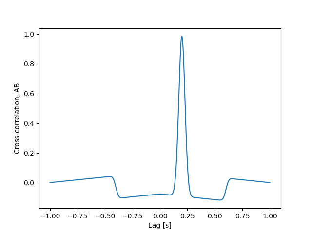
The problem we are concerned with is how much do we need shift signal A, either forward or backward in time, in order for it to best line up with signal B. In other words, what is the time lag between A and B. In the context of analyzing light curves from AIA, this gives us a proxy for the cooling time between two narrowband channels and thus two temperatures. To find this, we can compute the cross-correlation between the two signals and find which “lag” yields the highest correlation.
lags = get_lags(time)
cc = cross_correlation(s_a, s_b, lags)
plt.plot(lags, cc)
plt.xlabel("Lag [s]")
plt.ylabel("Cross-correlation, AB")
Text(42.722222222222214, 0.5, 'Cross-correlation, AB')
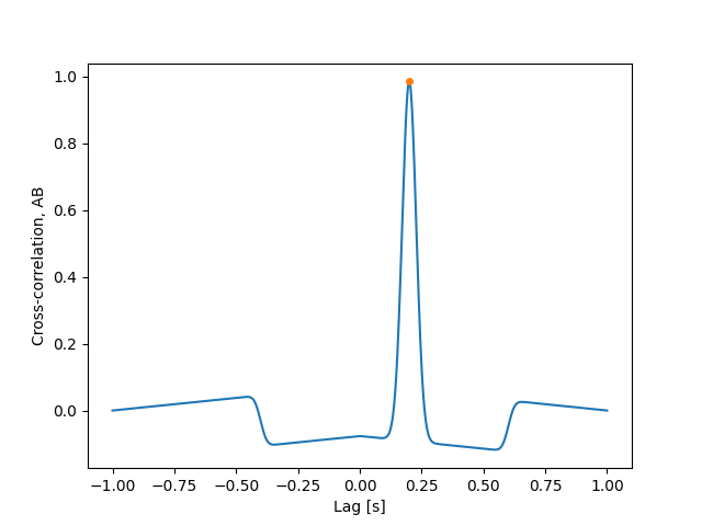
Additionally, we can also easily calculate the maximum value of the cross-correlation and the associate lag, or the time lag.
tl = time_lag(s_a, s_b, time)
max_cc = max_cross_correlation(s_a, s_b, time)
plt.plot(lags, cc)
plt.plot(tl, max_cc, marker="o", ls="", markersize=4)
plt.xlabel("Lag [s]")
plt.ylabel("Cross-correlation, AB")
Text(42.722222222222214, 0.5, 'Cross-correlation, AB')
As expected from the first intensity plot, we find that the lag which maximizes the cross-correlation is approximately the separation between the mean values of the Gaussian pulses.
print("Time lag, A -> B = ", tl)
Time lag, A -> B = 0.2004008016032064 s
Note that a positive time lag indicates that signal A has to be shifted forward in time to match signal B. By reversing the order of the inputs, we also reverse the sign of the time lag.
print("Time lag, B -> A =", time_lag(s_b, s_a, time))
Time lag, B -> A = -0.2004008016032064 s
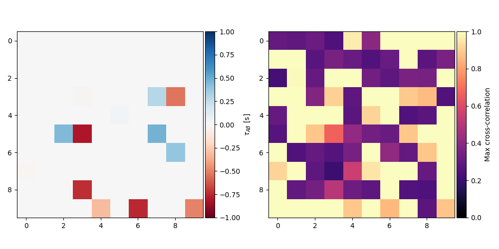
The real power in the time lag approach is it’s ability to reveal large scale patterns of cooling in images of the Sun, particularly in active regions. All of these functions can also be applied to intensity data cubes to create a “time lag map”.
As an example, we’ll create a fake data cube by repeating Gaussian pulses with varying means and then add some noise to them
rng = np.random.default_rng()
means_a = np.tile(rng.standard_normal((10, 10)), (*time.shape, 1, 1)) * u.s
means_b = np.tile(rng.standard_normal((10, 10)), (*time.shape, 1, 1)) * u.s
noise = 0.2 * (-0.5 + rng.random(means_a.shape))
s_a = gaussian_pulse(np.tile(time, (*means_a.shape[1:], 1)).T, means_a, 0.02 * u.s) + noise
s_b = gaussian_pulse(np.tile(time, (*means_b.shape[1:], 1)).T, means_b, 0.02 * u.s) + noise
We can now compute a map of the time lag and maximum cross correlation.
max_cc_map = max_cross_correlation(s_a, s_b, time)
tl_map = time_lag(s_a, s_b, time)

fig = plt.figure(figsize=(10, 5))

ax = fig.add_subplot(121)
im = ax.imshow(tl_map.value, cmap="RdBu", vmin=-1, vmax=1)
cax = make_axes_locatable(ax).append_axes("right", size="5%", pad="1%")
cb = fig.colorbar(im, cax=cax)
cb.set_label(r"$\tau_{AB}$ [s]")

ax = fig.add_subplot(122)
im = ax.imshow(max_cc_map.value, vmin=0, vmax=1, cmap="magma")
cax = make_axes_locatable(ax).append_axes("right", size="5%", pad="1%")
cb = fig.colorbar(im, cax=cax)
cb.set_label(r"Max cross-correlation")

fig.tight_layout()
In practice, these data cubes are often very large, sometimes many
GB, such that doing operations like these on them can be prohibitively
expensive. All of these operations can be parallelized and distributed
easily by passing in the intensity cubes as Dask arrays. Note that we
strip the units off of our signal arrays before creating the Dask arrays
from the as creating a Dask array from an Quantity may
result in undefined behavior.
s_a = dask.array.from_array(s_a.value, chunks=(*s_a.shape[:1], 5, 5))
s_b = dask.array.from_array(s_b.value, chunks=(*s_b.shape[:1], 5, 5))
tl_map = time_lag(s_a, s_b, time)
print(tl_map)
dask.array<mul, shape=(10, 10), dtype=float64, chunksize=(2, 10), chunktype=astropy.Quantity>
Rather than being computed “eagerly”, time_lag() returns
a graph of the computation that can be handed off to a distributed
scheduler to be run in parallel. This is extremely advantageous for
large data cubes as these operations are likely to exceed the
memory limits of most desktop machines and are easily accelerated through
parallelism.
plt.show()
Total running time of the script: (0 minutes 0.267 seconds)