
Visualizing ND objects#
Visualizing NDCubes#
NDCube provides a simple-to-use, yet powerful visualization method, plot, which produces sensible visualizations based on the dimensionality of the data and optional user inputs.
It is intended to be a useful quicklook tool and not a replacement for high quality plots or animations, e.g. for publications.
Let’s define an NDCube as with a shape of (4, 4, 5) and physical axes of helioprojective longitude, latitude and wavelength.
Click the “Source code” link immediately below to see this NDCube instantiated.
The plot method can be called very simply.
>>> import matplotlib.pyplot as plt
>>> ax = my_cube.plot()
>>> plt.show()
(Source code, png, hires.png, pdf)

Note how no arguments are required.
The necessary information to generate the plot is derived from the data and metadata in the NDCube.
The axis labels are taken from the WCS axis names defined in my_cube.wcs.wcs.cname.
Defining these when the WCS is instantiated allows users to customize their axis names.
However if they choose not to, the axis names are derived from the physical types in my_cube.wcs.world_axis_physical_types.
The type of visualization returned is derived from the dimensionality of the data.
For a >2 array axes, as is the case above, an animation object is returned displaying either a line or image with sliders for each additional array axis.
These sliders are used to sequentially update the line or image as it moves along its corresponding array axis, thus animating the data.
By default and image animation is returned.
(See below to learn how to use plot_axes kwarg to produce a line animation.)
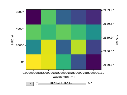
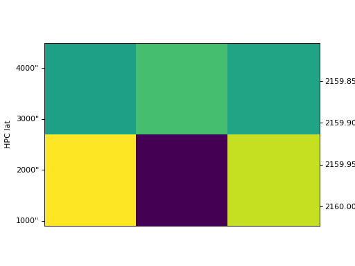
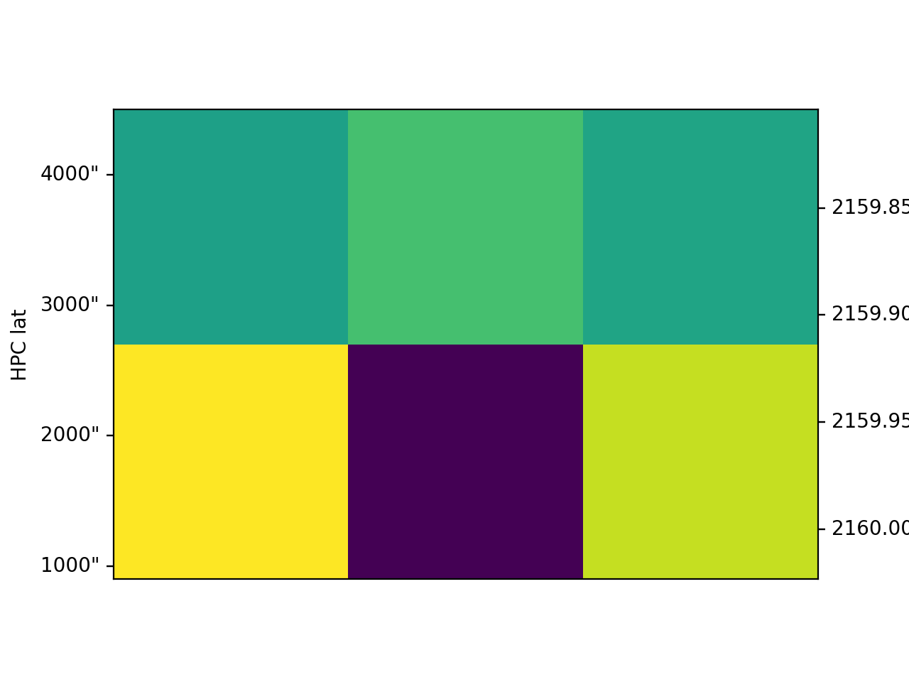
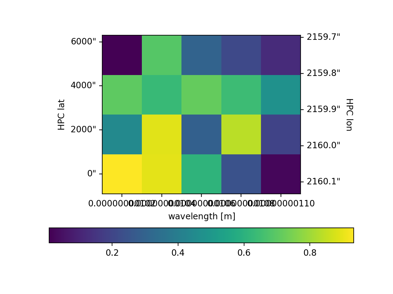
For for data with two array axes, an image is produced similar to that of matplotlib.pyplot.imshow.
>>> ax = my_cube[0].plot()
>>> plt.show()
(Source code, png, hires.png, pdf)
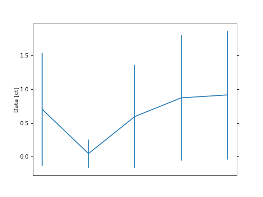
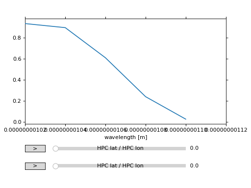
For data with one array axis, a line plot is produced, similar to matplotlib.pyplot.plot.
>>> ax = my_cube[1, 1].plot()
>>> plt.show()
(Source code, png, hires.png, pdf)
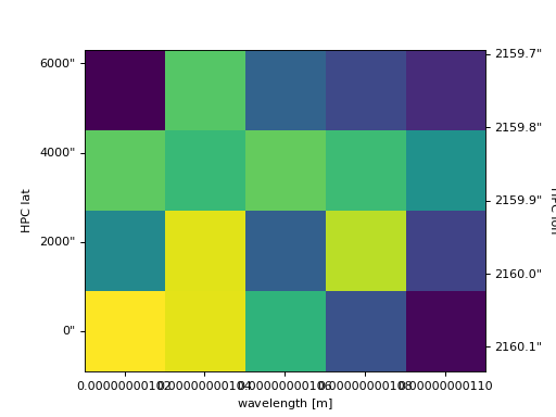
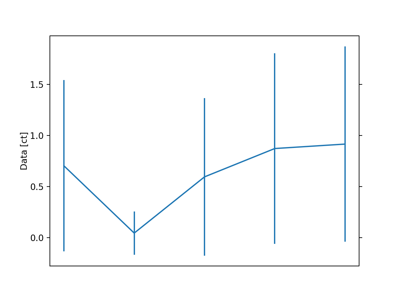
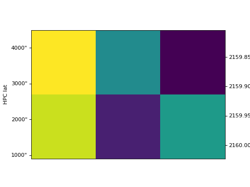
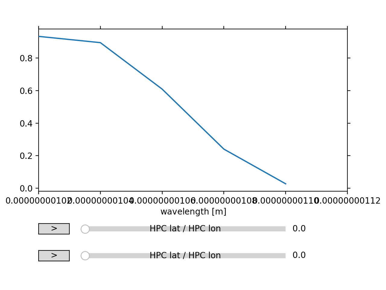
Setting the x and y ranges of the plot can be done simply by indexing the NDCube object to the desired region of interest and then calling the plot method, e.g.
>>> ax = my_cube[0, 1:3, 1:4].plot()
>>> plt.show()
(Source code, png, hires.png, pdf)
Note that sometimes axis tickmarks are missing.
This is a caused by a behavior in WCSAxes whereby the ticks and labels are omitted if the plot extends beyond the valid range of the WCS projection.
This can happen when matplotlib pads the axes and can be overcome by zooming into the image slightly so that the plot boundaries are again within the valid range of the WCS projection.
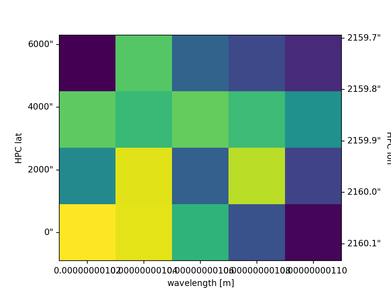
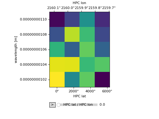
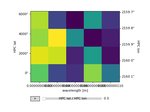
Visualizations can be customized via the use of kwargs.
For NDCube instances with more than one array axis, the plot_axes keyword is used to determine which array axes are displayed on which plot axes.
It is set to a list with a length equal to the number of array axes in array axis order.
The array axis to be displayed on the x-axis is marked by 'x' in the corresponding element of the plot_axes list, while the array axis for the y-axis is marked with a 'y'.
If no 'y' axis is provided, a line animation is produced.
By default the plot_axes argument is set so that the last array axis to shown on the x-axis and the penultimate array axis is shown on the y-axis.
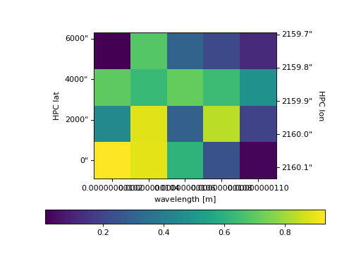
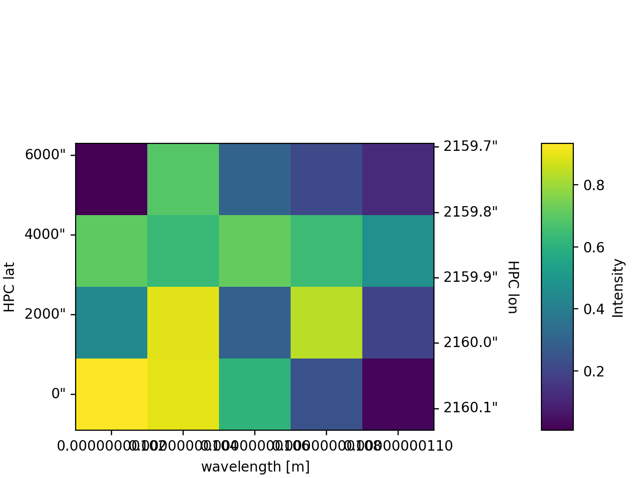
>>> ax = my_cube.plot(plot_axes=[None, 'x', 'y'])
>>> plt.show()
(Source code, png, hires.png, pdf)
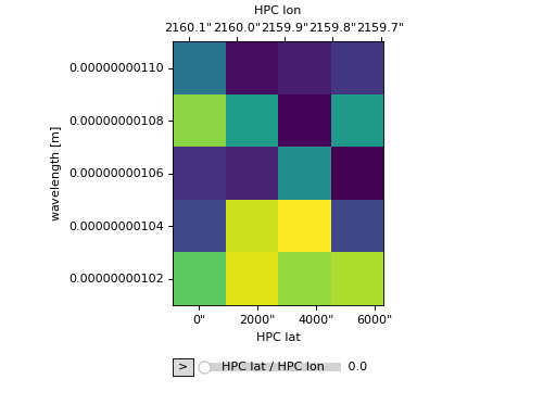
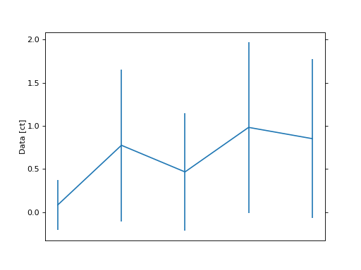
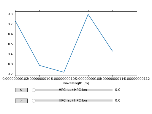
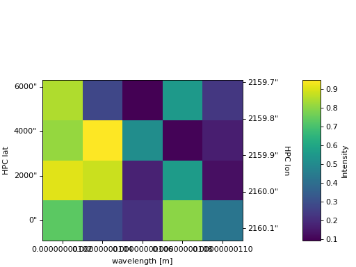
The plot_axes kwarg can also be used to generated a line animation by omitting the 'y' entry.
>>> ax = my_cube.plot(plot_axes=[None, None, 'x'])
>>> plt.show()
(Source code, png, hires.png, pdf)
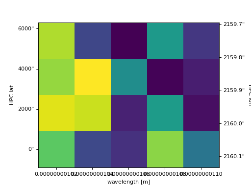
plot uses WCSAxes to produce all plots.
This enables a rigorous representation of the coordinates on the plot, including those that are not aligned to the pixel grid.
It also enables the coordinates along the plot axes to be updated between frames of an animation.
ndcube.NDCube.plot therefore allows users to decide which WCS object to use, either wcs or combined_wcs which also includes the ExtraCoords.
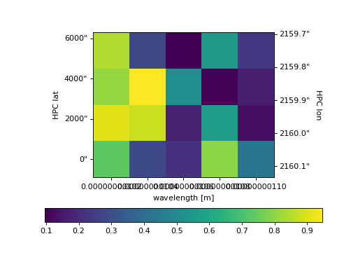
>>> ax = my_cube.plot(wcs=my_cube.combined_wcs)
>>> plt.show()
(Source code, png, hires.png, pdf)
Adding Colorbars#
Working with the output of ndcube.NDCube.plot is the context of matplotlib figures and axes can be a great way of creating more complex plots.
Here we will show two examples of home to add a colorbar.
The first is simple and depends on matplotlib.pyplot.
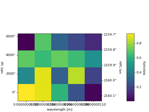
>>> ax = my_cube[0].plot()
>>> cbar = plt.colorbar(orientation="horizontal")
>>> plt.show()
(Source code, png, hires.png, pdf)
The second example shows how to more intricately play with NDCube visualizations and matplotlib figures and axes.
This includes adding the output of ndcube.NDCube.plot to an existing axes object.
>>> fig = plt.figure()  # Create a figure
>>> # Create WCSAxes object and then add the NDCube plot by setting the axes kwarg.
>>> ax = fig.add_axes([0.1, 0.1, 0.6, 0.6], projection=my_cube[0].wcs)
>>> ax = my_cube[0].plot(axes=ax)
>>> # Create the colorbar axes object and scale it by the image.
>>> cax = fig.add_axes([0.85, 0.1, 0.05, 0.6])
>>> im = ax.get_images()[0]  # Retrieve the plot AxesImage by which to scale colorbar.
>>> cbar = fig.colorbar(im, cax=cax, label="Intensity")
>>> plt.show()
(Source code, png, hires.png, pdf)
Visualizing NDCubeSequences#
Since ndcube 2.0, the NDCubeSequence visualization support has been significantly simplified.
The sequence axis can only be an animated axis and cannot be represented as a plot axis.
This enables the visualization to passed off to the NDCube infrastructure.
The rationale for this is outlined in Issue #321 on the ndcube GitHub repo.
For many users this simplified support will be sufficient and they may not even notice the change.
However if you feel that NDCubeSequence should provide more complex visualization support, please let us know by commenting on that issue and telling us of your use case.
If you would like to visualize your NDCubeSequence in a more complex or customized way, there are still several options.
For example, you can slice out a single NDCube and use its plot method.
You can extract the data and use the myriad of plotting packages available in the Python ecosystem.
Finally, if you want to be advanced, you can write your own mixin class to define the plotting methods.
Below, we will outline these latter two options in a little more detail.
Extracting and Plotting NDCubeSequence Data with Matplotlib#
In order to produce plots (or perform other analysis) outside of the ndcube framework, it may be useful to extract the data from the NDCubeSequence into single ndarray instances.
Let’s first define an NDCubeSequence with a common axis of 0 and time as an extra coord stretching across the cube along the common axis.
To extract and plot the data.
>>> import astropy.units as u
>>> import astropy.wcs
>>> import numpy as np
>>> from astropy.time import Time, TimeDelta

>>> from ndcube import ExtraCoords, NDCube, NDCubeSequence

>>> # Define data arrays.
>>> shape = (3, 4, 5)
>>> data0 = np.random.rand(*shape)
>>> data1 = np.random.rand(*shape)
>>> data2 = np.random.rand(*shape)

>>> # Define WCS transformations. Let all cubes have same WCS.
>>> wcs = astropy.wcs.WCS(naxis=3)
>>> wcs.wcs.ctype = 'WAVE', 'HPLT-TAN', 'HPLN-TAN'
>>> wcs.wcs.cunit = 'Angstrom', 'deg', 'deg'
>>> wcs.wcs.cdelt = 0.2, 0.5, 0.4
>>> wcs.wcs.crpix = 0, 2, 2
>>> wcs.wcs.crval = 10, 0.5, 1

>>> # Define time extra coordinates of time for each cube.
>>> common_axis = 0
>>> base_time = Time('2000-01-01', format='fits', scale='utc')
>>> timestamps0 = Time([base_time + TimeDelta(60 * i, format='sec') for i in range(data0.shape[common_axis])])
>>> timestamps1 = Time([base_time + TimeDelta(60 * (i+1), format='sec') for i in range(data1.shape[common_axis])])
>>> timestamps2 = Time([base_time + TimeDelta(60 * (i+1), format='sec') for i in range(data2.shape[common_axis])])

>>> # Define the cubes
>>> cube0 = NDCube(data0, wcs=wcs)
>>> cube0.extra_coords.add('time', 0, timestamps0)
>>> cube1 = NDCube(data1, wcs=wcs)
>>> cube1.extra_coords.add('time', 0, timestamps1)
>>> cube2 = NDCube(data2, wcs=wcs)
>>> cube2.extra_coords.add('time', 0, timestamps2)

>>> # Define the sequence
>>> my_sequence = NDCubeSequence([cube0, cube1, cube2], common_axis=common_axis)
To make a 4D array out of the data arrays within the constituent NDCube instances in
my_sequence.
>>> data4d = np.stack([cube.data for cube in my_sequence.data], axis=0)
>>> data4d.shape
(3, 3, 4, 5)
The same applies to other array-like data in the NDCubeSequence, like uncertainty and mask.
If instead, we want to define a 3D array where every NDCube in the NDCubeSequence is appended along the common_axis, we can use numpy.concatenate function.
>>> data3d = np.concatenate([cube.data for cube in my_sequence.data],
...                         axis=my_sequence._common_axis)
>>> data3d.shape
(9, 4, 5)
Having extracted the data, we can now use matplotlib to visualize it.
Let’s say we want to produce a timeseries of how intensity changes in a given pixel at a given wavelength.
We stored time in my_sequence.common_axis_coords and associated it with the common_axis.
Therefore, we could do:
>>> import matplotlib.pyplot as plt
>>> # Get intensity at pixel 0, 0, 0 in each cube.
>>> intensity = np.array([cube.data[0, 0, 0] for cube in my_sequence])
>>> times = Time([cube.axis_world_coords('time', wcs=cube.combined_wcs)[0][0] for cube in my_sequence])
>>> plt.plot(times.datetime, intensity)
>>> plt.xlabel("Time")
>>> plt.ylabel("Intensity")
>>> plt.show()
Alternatively, we could produce a 2D dynamic spectrum showing how the spectrum in a given pixel changes over time.
>>> import matplotlib as mpl
>>> import matplotlib.pyplot as plt
>>> from astropy.time import Time
>>> # Combine spectrum over time for pixel 0, 0.
>>> spectrum_sequence = my_sequence[:, :, 0]
>>> intensity = np.concatenate([cube.data for cube in spectrum_sequence.data], axis=0)
>>> times = Time(np.concatenate([cube.axis_world_coords('time', wcs=cube.combined_wcs)[0].value for cube in my_sequence]), format='fits', scale='utc')
>>> # Assume that the wavelength in each pixel doesn't change as we move through the sequence.
>>> wavelength = spectrum_sequence[0].axis_world_coords("em.wl")[0]
>>> # As the times may not be uniform, we can use NonUniformImage to show non-uniform pixel sizes.
>>> fig, ax = plt.subplots(1, 1)
>>> im = mpl.image.NonUniformImage(
...     ax, extent=(times[0], times[-1], wavelength[0], wavelength[-1]))
>>> im.set_data(wavelength, times.mjd, intensity)
>>> ax.add_image(im)
>>> ax.set_xlim(times.mjd[0], times.mjd[-1])
>>> ax.set_xlabel("Time [Modified Julian Day]")
>>> ax.set_ylim(wavelength[0].value, wavelength[-1].value)
>>> ax.set_ylabel(f"Wavelength [{wavelength.unit}]")
>>> plt.show()
Now let’s say we want to animate our data, for example, to show how the intensity changes over wavelength and time.
For this we can use ImageAnimator.
In my_sequence, the sequence axis represents time, the 0th and 1st cube axes represent latittude and longitude, while the final axis represents wavelength.
Therefore, we could do the following.
>>> from mpl_animators import ImageAnimator
>>> data = np.stack([cube.data for cube in my_sequence.data], axis=0)
>>> # Assume that the field of view or wavelength grid is not changing over time.
>>> # Also assume the coordinates are independent and linear with the pixel grid.
>>> animation = ImageAnimator(data, image_axes=[2, 1])
>>> plt.show()
Alternatively we can animate how the one 1-D spectrum changes by using LineAnimator.
>>> from mpl_animators import LineAnimator
>>> data = np.stack([cube.data for cube in my_sequence.data], axis=0)
>>> animation = LineAnimator(data, plot_axis_index=-1)
>>> plt.show()
Writing Your Own NDCubeSequence Plot Mixin#
ncube allows you to write your own plotting functionality for NDCubeSequence if the current support doesn’t meet your needs.
In many cases, this might be simpler as you may be able to make some assumptions about the data you will be analyzing and therefore won’t have to write as generalized a tool.
The best way to do this is to write your own mixin class defining the plot methods, e.g.
class MySequencePlotMixin:
    def plot(self, **kwargs):
        pass  # Write code to plot data here.

    def plot_as_cube(self, **kwargs):
        pass  # Write code to plot data concatenated along common axis here.
Then you can create your own NDCubeSequence by combining your mixin with NDCubeSequenceBase which holds all the non-plotting functionality of the NDCubeSequence.
class MySequence(NDCubeSequenceBase, MySequencePlotMixin):
This will create a new class, MySequence, which contains all the functionality of NDCubeSequence plus the plot methods you’ve defined in MySequencePlotMixin.
There are many other ways you could visualize the data in your NDCubeSequence and many other visualization packages in the Python ecosystem that you could use.
These examples show just a few simple ways which can get help you reach of visualization goals.